Responsive scaling
Content and containers are stacked differently to fit different screen sizes and formats.

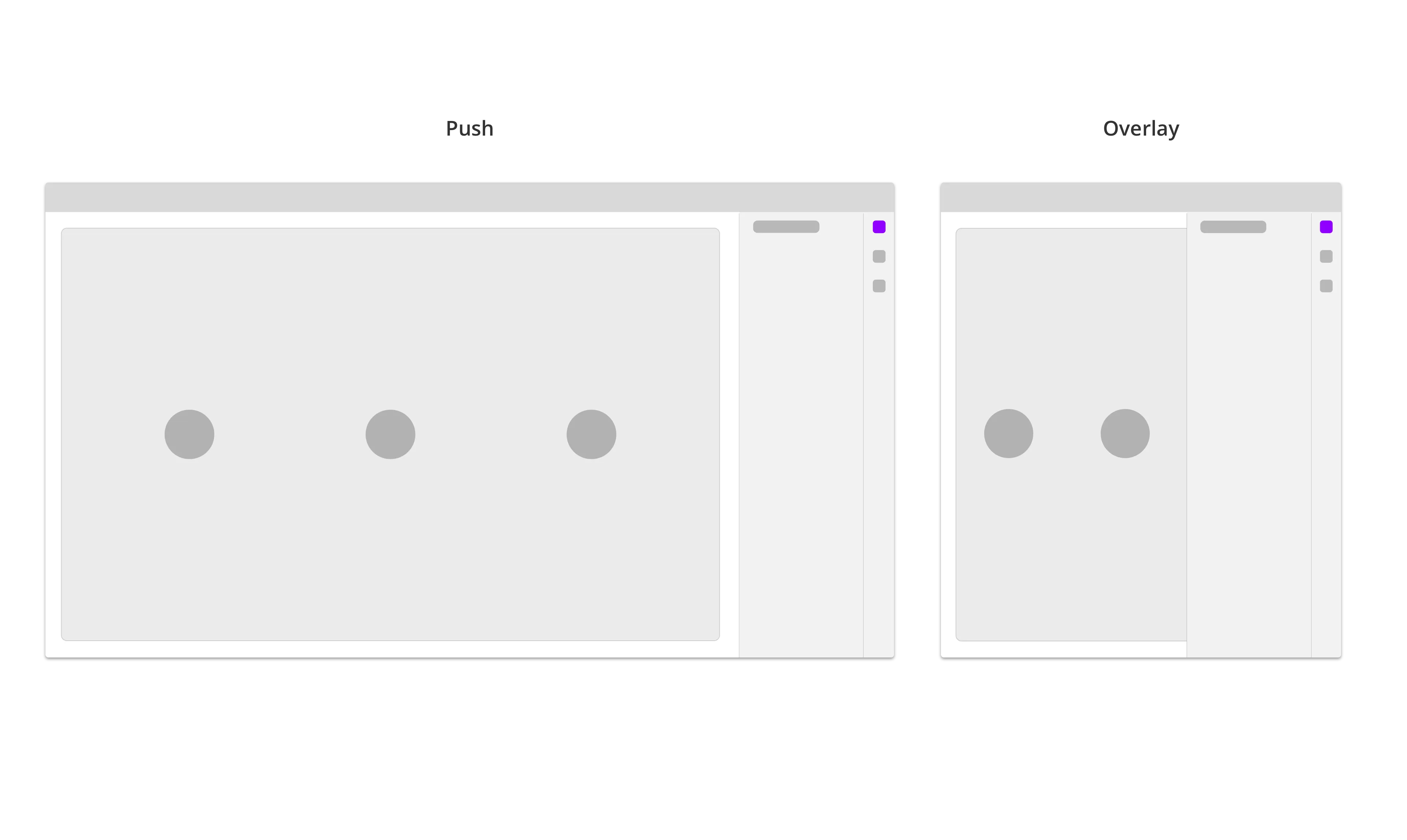
Push vs overlay
The Sidebar will push and resize the page (content) on wider screens. When the screen size is smaller, the Sidebar will overlap the page. On even smaller screens, the sidebar will take the full screen.
Sidebar
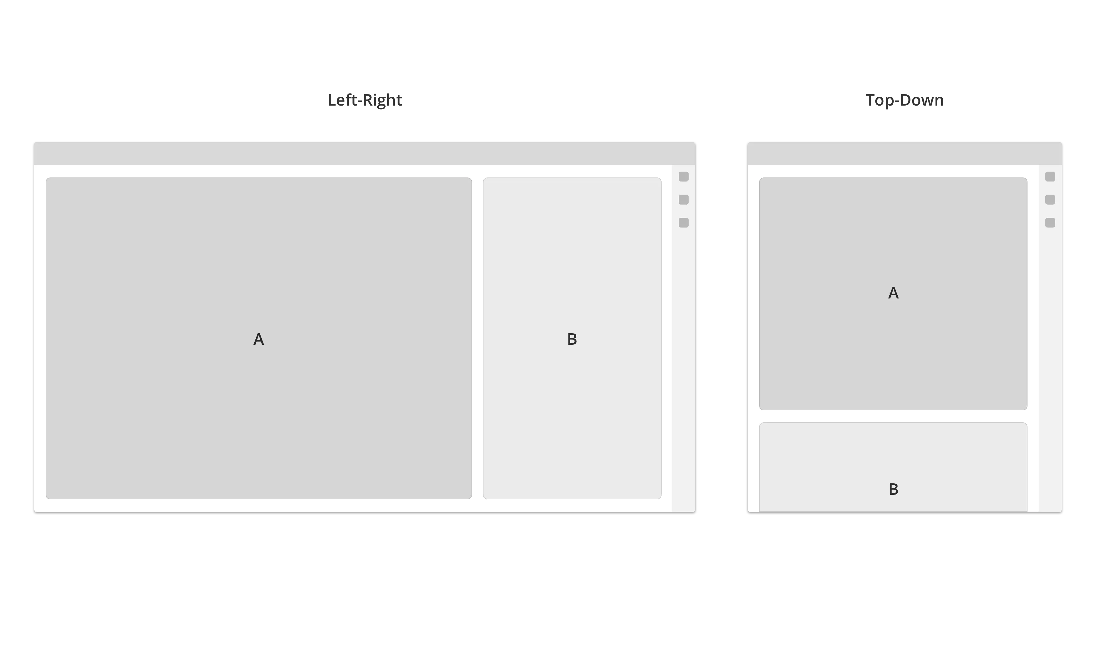
Stack
On wide screens, the content are arranged from left to right. When the screen size get smaller, it will stack the content from top to bottom.

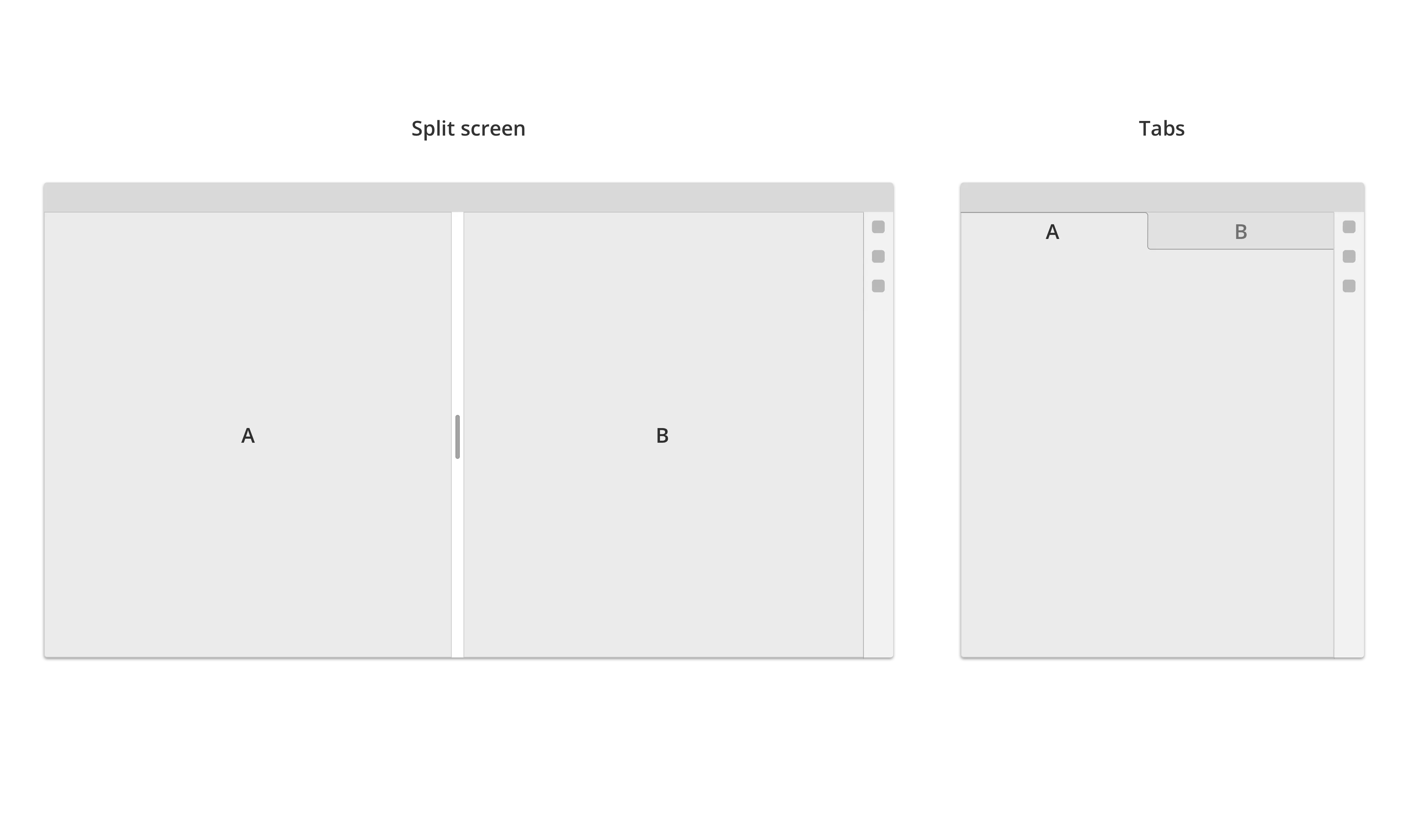
Split - Tab
Pages are usually stacked in tabs, but can also run in split screen on large screen sizes (optional).
Tabs
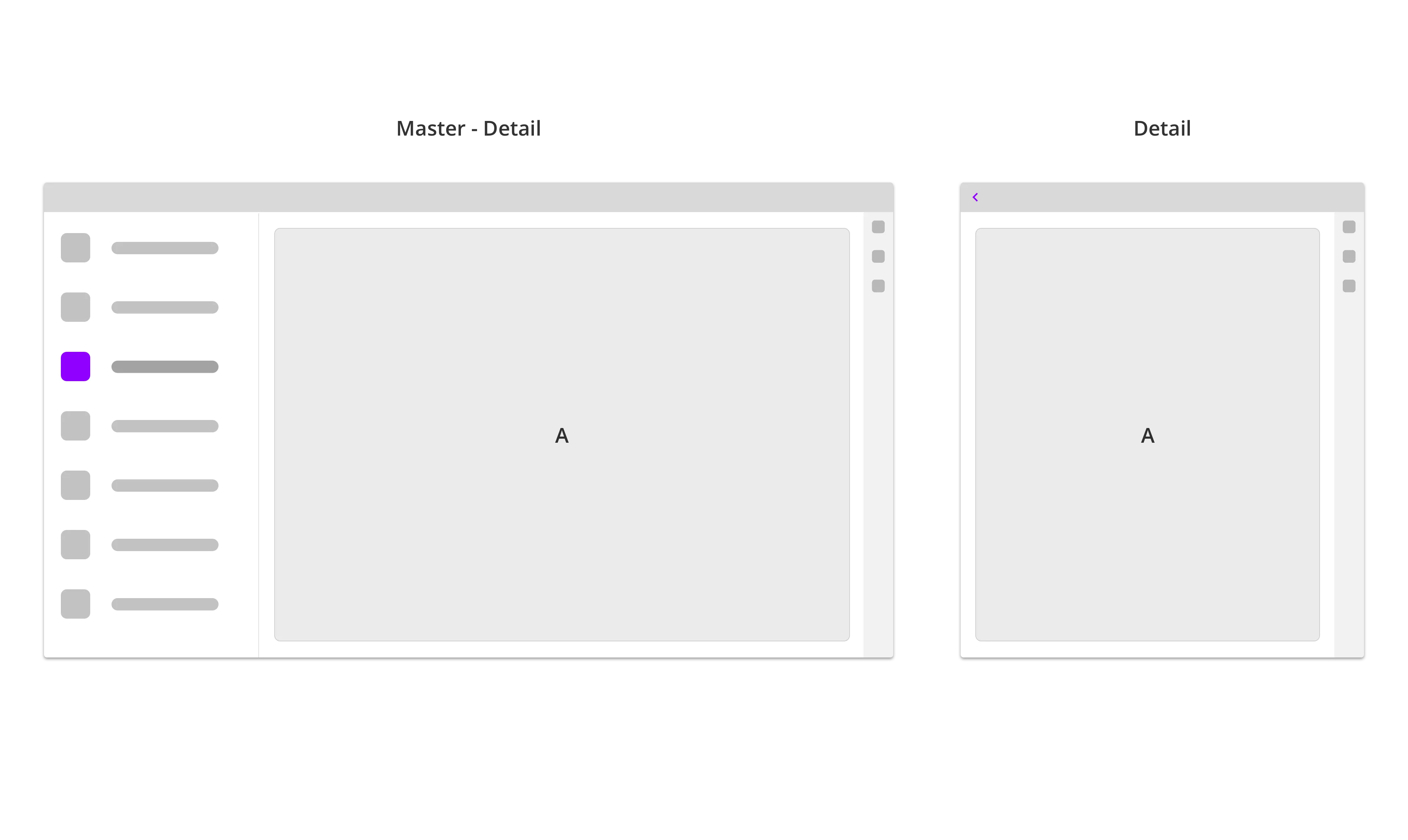
Master - detail view
Sections like Settings are arranged in a Master-Detail structure. On wide screen sizes two or more levels in the Settings-hierarchy are visible and stacked from left to right. When window is resized to a smaller screen, the master page will collapse, and the detail screen will go full screen. If there is three or more setting layers visible, it will collapse the topmost layer first (starting from the left side).
Settings